Color Trends 2026
Last Updated: February 12, 2026
Color Trends 2026
Each year, most paint manufacturers release a “Color of the Year” along with a palette of complementary shades. Pantone — the global authority on color — is best known for the Pantone Matching System (PMS), which provides a standardized language for identifying, matching, and communicating color across design, fashion, printing, and manufacturing. Their annual selection is often a strong predictor of broader color trends and frequently aligns with the palettes chosen by major paint manufacturers.
That does not appear to be the case in 2026. While Pantone leans toward softer pastels, most paint brands are trending toward neutral, earthy tones.
Colors of the Year
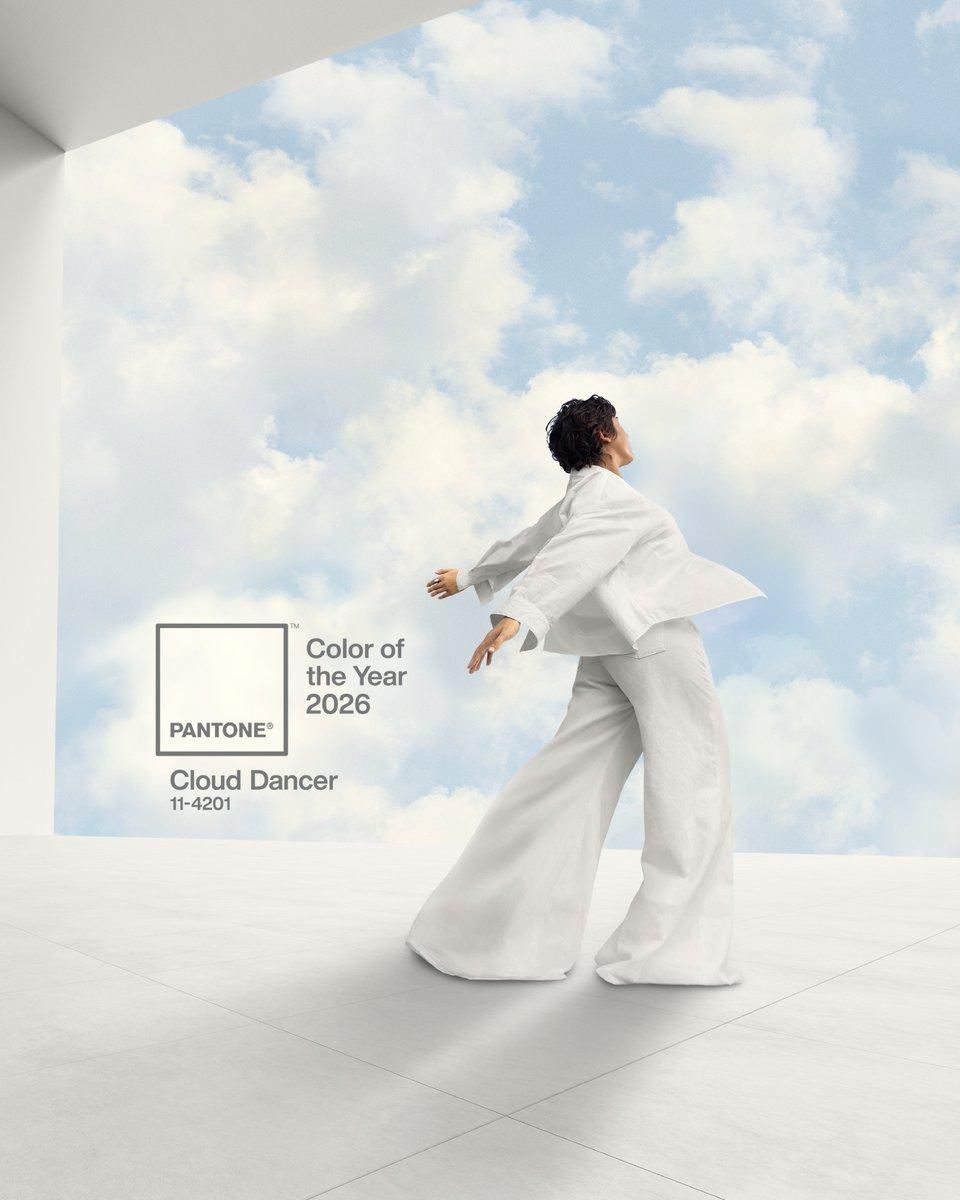
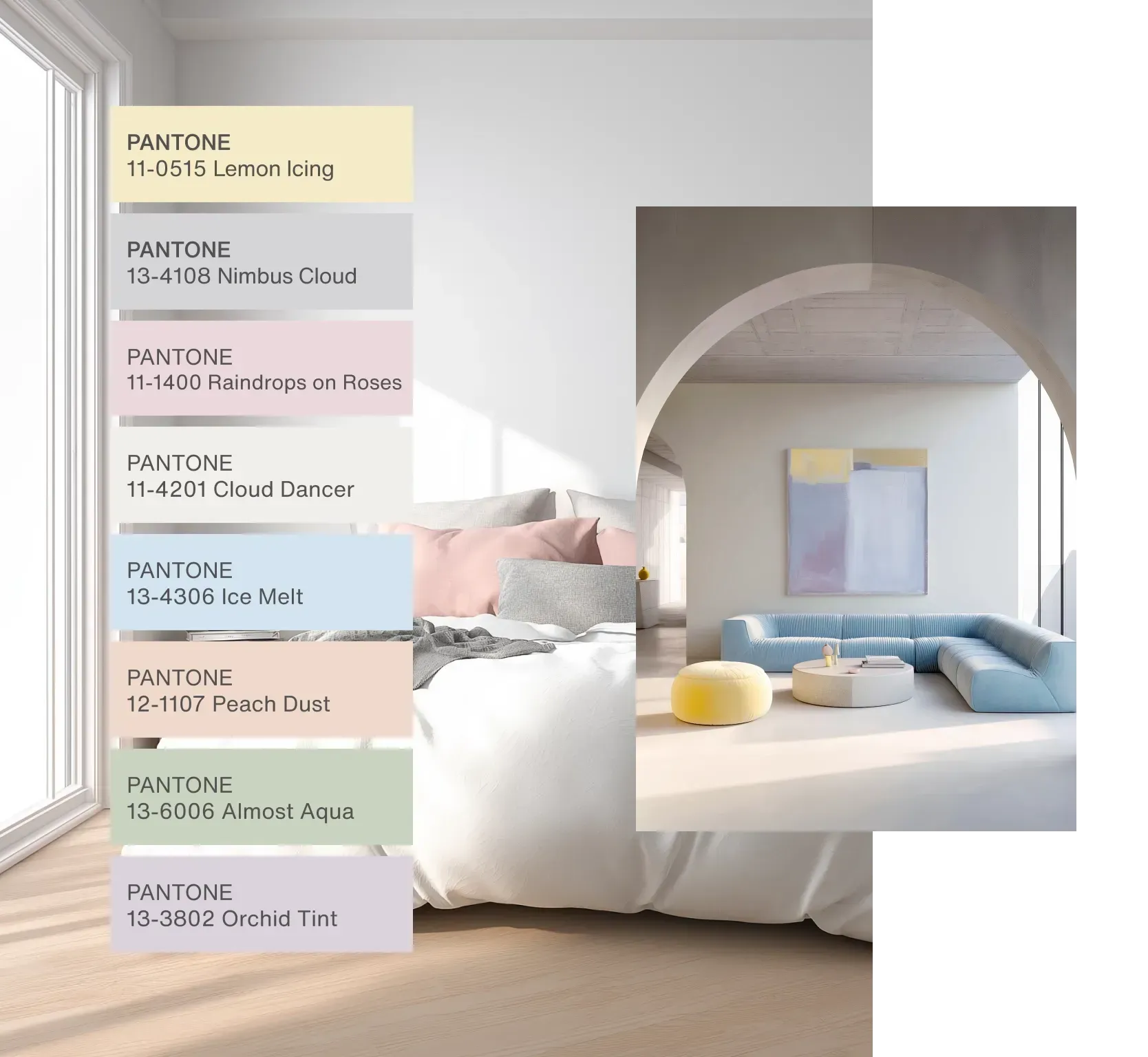
Pantone: Cloud Dancer 11-4201
For 2026, Pantone highlights Cloud Dancer 11-4201 as “a key structural color whose versatility provides scaffolding for our color spectrum, allowing all colors to shine.” Their accompanying palette of powdered pastels pairs particularly well with coastal homes and lighter interior styles.
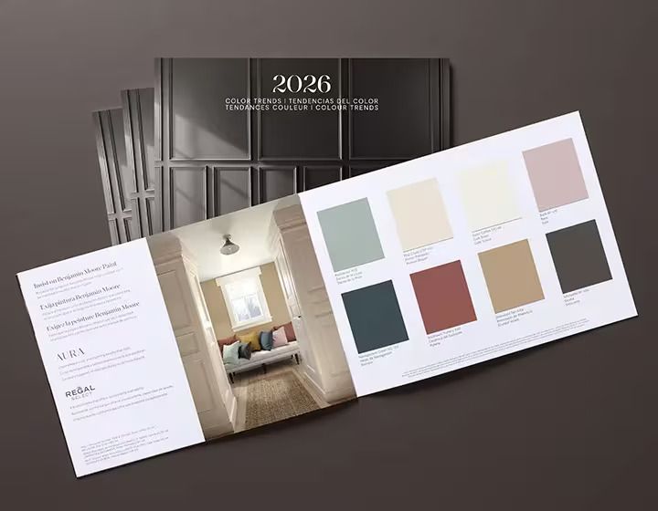
Benjamin Moore: Silhouette AF-655
According to Benjamin Moore, Silhouette AF-655 “weaves a narrative of refined style and grace into this layered palette of enchanting pales and handsome midtones.” While the featured color itself may not immediately evoke coastal themes, the surrounding palette of muted pastels and earthy tones can work beautifully in a beach house setting.
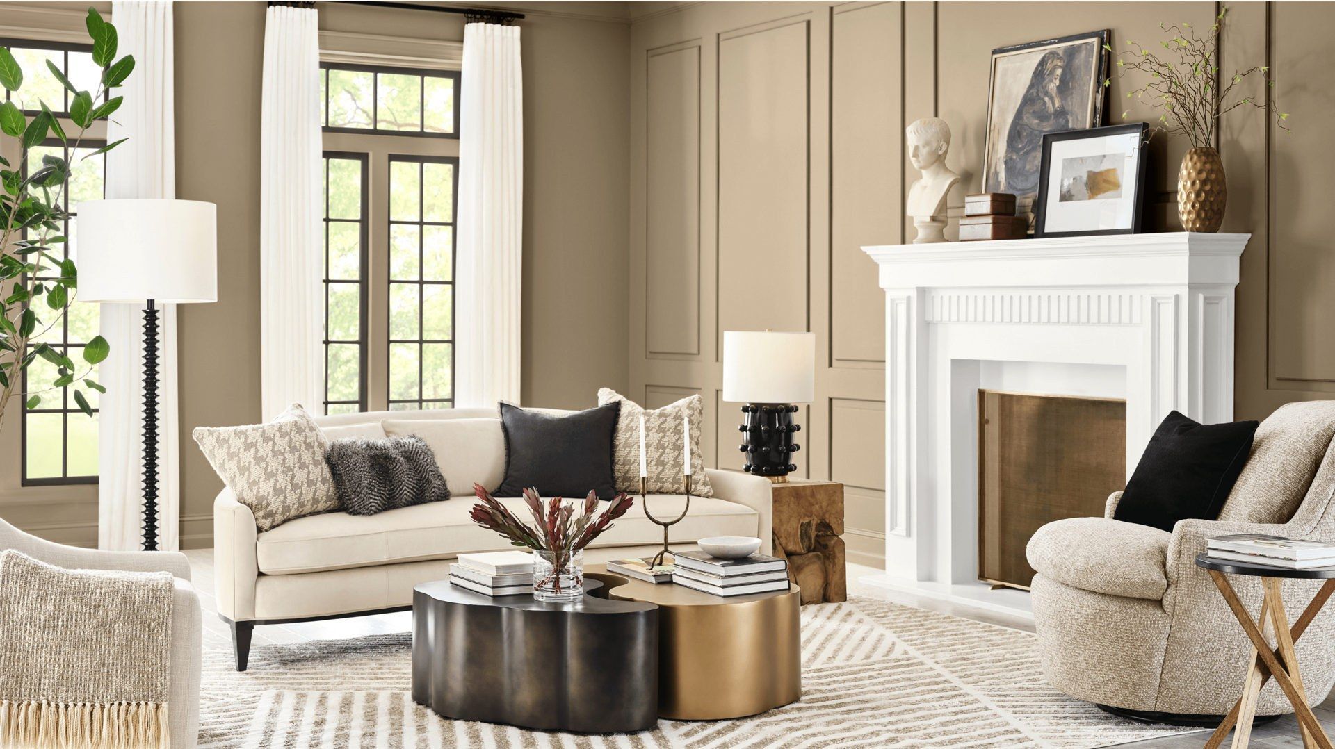
Sherwin-Williams: Universal Khaki SW 6150
Sherwin-Williams describes Universal Khaki SW 6150 as promoting “strength and simplicity,” calling it “an essential neutral selected by our color experts for its beautiful balance of livability and longevity.” Similar to Benjamin Moore’s direction, their palette emphasizes warm, grounded earth tones.
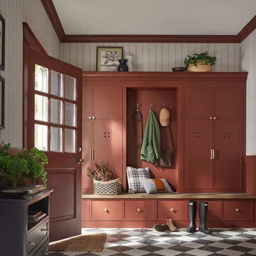
PPG Paints: Warm Mahogany PPG1060-7
PPG’s Warm Mahogany continues the trend toward richer neutrals, positioning it as “a strong, stylish alternative to black or dark gray.” It reflects the broader industry movement toward depth and warmth in residential color choices.
The Bottom Line
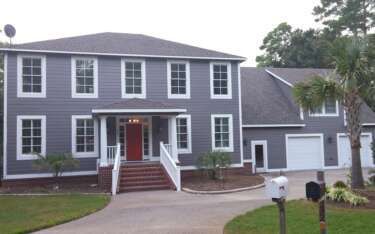
Regardless of marketing language or annual trends, you — and your guests — ultimately live with the colors you choose for your vacation home. A thoughtful palette of complementary shades will create a more appealing and cohesive environment.
One of the most common mistakes homeowners make when selecting paint is choosing color without considering existing furnishings and accessories. Most designers recommend starting with the furniture and décor, then selecting paint colors that harmonize with those elements rather than competing with them.